Local Content (Legacy version)
Description
Our legacy products are now deprecated. Please consider migrating to our newer product offerings.
Please use the new Local Content.
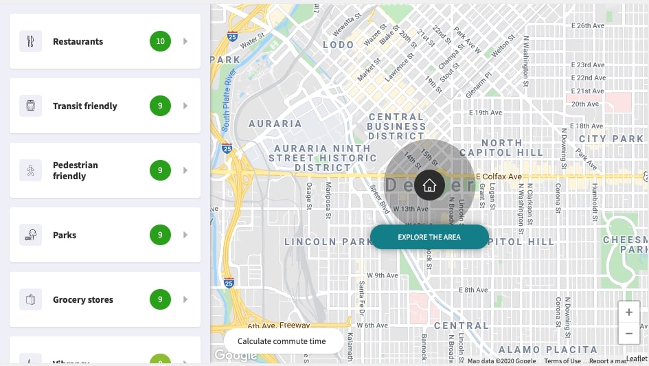
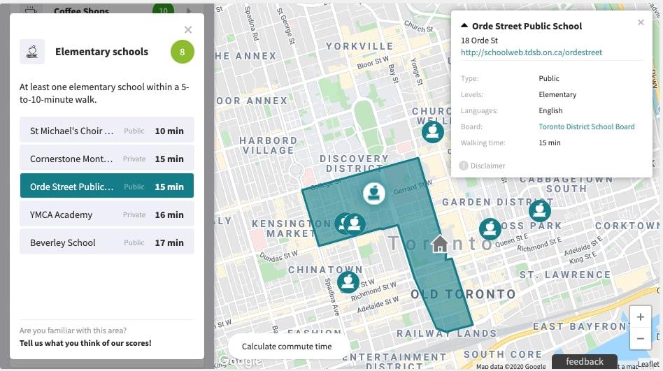
This widget evaluates all characteristics of a specific location. It displays Location Scores and related information, and it can be added to any property listing in Canada and the United States.


Example
<!DOCTYPE html>
<html>
  <head>
    <meta name="viewport" content="initial-scale=1.0" />
    <meta charset="utf-8" />
    <title>Local Logic - Local Content Example</title>
  </head>
  <body>
    <!-- Local Logic Widget DOM element -->
    <div id="local-content"></div>

    <script type="text/javascript">
      // Callback that is called when the SDK is ready to be used
      function initLocallogic() {
        var contentWidget = new locallogic.LocalContent("local-content", {
          lat: 45.501734,
          lng: -73.56542,
          designId: "ll-2019",
        });
      }
    </script>

    <!-- Load the Local Logic SDK with your Local Logic token -->
    <script
      async
      defer
      src="https://cdn.locallogic.co/sdk/?token={YOUR_TOKEN}&callback=initLocallogic"
    ></script>
  </body>
</html>
To test this example live, make sure to replace the {YOUR_TOKEN} placeholder with the token we provided to you.
Options
| Parameter | Status | Description |
|---|---|---|
| lat | required | A decimal number between -90 and 90 (Latitude) |
| lng | required | A decimal number between -180 and 180 (Longitude) |
| designId | required | String value specifying which Local Content design should be loaded. Use 'll-2019' for the latest design version. This parameter is used to ensure compatibility between clients. |
| locale | optional | String value that specifies the language of the scores and the UI interface. Available: fr (French), en (English), en-us (U.S. English).Default: en |
| color | optional | Hexadecimal value of the main color. Default: #017f8f |
| basemap | optional | String value that specifies the basemap of the widget. When selecting the Google Maps basemap ( google), make sure that the Google Maps JavaScript API has been loaded. Here’s an example where the Local Logic code would go inside the initMap function.Available: maptiler, esri, google, bing, osm, mapbox, appleDefault: maptiler |
| googleStyles | optional | If you select the Google basemap (google), you can select which style you want or use a custom style. Available: Standard, Silver, Retro, Dark, Night, AubergineDefault: standard |
| esriBasemapLayer | optional | If you select the Esri Vector basemap (esri), you can select which basemap layer you want.Available: Gray, Topographic, Streets, StreetsReliefDefault: Gray |
| appleMapsType | optional | If you select the Apple basemap (apple), you can select which style of map you would like to display.Available: default, satellite, hybridDefault: default |
| appleMapsToken | optional | If you select the (apple) basemap, you must provide your MapKit JS JSON Web Token |
| bingMapsKey | optional | If you select the bing basemap, you must provide your Bing Maps Key |
| esriKey | optional | If you select the esri basemap, you can provide your Esri Maps Key |
| maptilerKey | optional | If you select the maptiler basemap, you can provide your MapTiler Maps Key |
| osmUrl | optional | If you select the Open Street Maps (osm) basemap, you can provide a custom Tile Server url |
| mapboxAccessToken | optional | If you select Mapbox (mapbox) basemap, you must provide your Mapbox Access Token |
| mapboxStyle | optional | If you select Mapbox (mapbox) basemap, you must provide your Mapbox Style URL. eg: mapbox://styles/mapbox/streets-v11 |
| maptilerStyle | optional | If you select Maptiler (maptiler) basemap, you can select which style you want. Available: Streets, Bright, BasicDefault: Streets |
| scrollWheelZoom | optional | Boolean value that specifies if the map can be zoomed with the mouse wheel. Default: true |
| houseIcon | optional | Stringify XML of an SVG icon that you want to use as the house icon on the Local Content map. |
| mapDragging | optional | Boolean value that specifies if you want the map to be scrollable in mobile view. When set to true, an overlay will be placed on the map to allow the page to scroll even when touching the map. This feature is recommended for implementations where the widget is on a page with a long scroll. This option only affects the Mobile View. Tapping on the overlay removes it, letting the user interact with the map, and a close button will appear to deactivate the map. Default: true |
| callback | optional | A function to be called when Location Scores are not available for a specific location. |
| availablePois | optional | Categories of points of interest (POIs) to display on the widget if available, separated by commas. |
| containerHeight | optional | String value that specifies the desired height of the widget on desktop. Can be any valid css height value, e.g. "600px", "100%", "90vh", etc. Values less than 450px will be ignored as this is the minimum optimum height of the widget for usability.Default: "450px" |
| maxInnerWidth | optional | Number value specifying the width (in pixels) of the inner section of your webpage. When this option is set, the map will fill the background of the widget and the score list will left-align with the left margin of your page (see image below). This option is ignored on mobile display and when the width of the widget container is less than the value specified for maxInnerWidth. |
| scoreOrder | optional | Option allowing to predetermine the order in which scores will be displayed e.g. [‘high_schools’, ‘groceries’, ‘quiet’,…] . |
| poiRadius | optional | Option allowing to extend the default POI radius display from 2000 meters (default) to 5000 meters (1.24 miles to 3.10 miles). |
| poiLimit | optional | Option allowing to extend the default number of POIs displayed from 30 (default) to 50. |
| hasLazyMap | optional | A boolean value that, if set to true, will make the Local Content map load only when the widget is visible to the user. This can help prevent unnecessary costs from some map providers (e.g. Google) that charge on map loads even when the widget is not visible to the user—for example, when it is hidden behind a tab, or if the user has not scrolled down to it. Default value: false |
Example

In this example, the maxInnerWidth option of the LocalContent widget is set to 1200.
How to setup Content Security Policy(CSP)
In order to ensure that MapTiler works correctly, client's CSP need to be updated to include the following -
worker-src blob: ;
child-src blob: ;
img-src data: blob: ;
connect-src https://*.tiles.mapbox.com https://api.mapbox.com https://events.mapbox.com ;
For more details, go to Maptiler website
Methods
changeLocation ({lat, lng})
For a Single Page Application, you can use this method to refresh the Local Content widget to a new location. This prevents having to re-instantiate the Local Content each time.
Single Page App
React example
To add the Local Content widget to your single page App. Render a html element on your App with a distinctive ID.
Then set an Interval to wait for the SDK to be loaded with the boolean window.LL_SDK_IS_READY
<!DOCTYPE html>
<html>
  <head>
    <meta name="viewport" content="initial-scale=1.0" />
    <meta charset="utf-8" />
    <title>Local Logic - Local Content Example</title>
  </head>
  <body>
    <div id="myApp"></div>
    <!-- Load React. -->
    <!-- Note: when deploying, replace "development.js" with "production.min.js". -->
    <script
      src="https://unpkg.com/react@16/umd/react.production.min.js"
      crossorigin
    ></script>
    <script
      src="https://unpkg.com/react-dom@16/umd/react-dom.production.min.js"
      crossorigin
    ></script>
    <script
      async
      defer
      src="https://cdn.locallogic.co/sdk/?token={YOUR_TOKEN}"
    ></script>

    <!-- Load our React component. -->
    <script type="text/javascript">
      "use strict";
      const elem = React.createElement;
      class MyApp extends React.Component {
        constructor(props) {
          super(props);
        }
        render() {
          return elem("div", { id: "local-content-widget" });
        }
        componentDidMount() {
          var llSdkInterval = window.setInterval(function () {
            if (window.LL_SDK_IS_READY) {
              var widget = new locallogic.LocalContent("local-content-widget", {
                lat: 45.50717558,
                lng: -73.5780121,
                designId: "ll-2019",
              });
              window.clearInterval(llSdkInterval);
            }
          }, 100);
        }
      }
      const domContainer = document.querySelector("#myApp");
      ReactDOM.render(elem(MyApp), domContainer);
    </script>
  </body>
</html>
To test this example live, make sure to replace the {YOUR_TOKEN} placeholder with the token we provided to you.
How to use with WordPress
Basic WordPress example
There are two steps for the easiest way to implement Local Content on a WordPress theme.
This example uses the twentytwenty theme.
Step 1. Add a div with a unique id in the corresponding template. In this case template-parts/content.php
<div class="entry-content">

  <?php
  if ( is_search() || ! is_singular() && 'summary' === get_theme_mod( 'blog_content', 'full' ) ) {
    the_excerpt();
  } else {
    the_content( __( 'Continue reading', 'twentytwenty' ) );
  }
  ?>

  // LOCAL CONTENT Widget
  <div id="local-content" style="max-width: 900px;"></div>

</div><!-- .entry-content -->
Step 2. Add javascript files on the functions.php. In this example we'll be printing the script into the footer.
This can also be done with wp_enqueue_script.
add_action('wp_footer', 'locallogic_sdk_wp_footer');
function locallogic_sdk_wp_footer() {
    ?>
    <script>
      function initLocallogic() {
        var contentWidget = new locallogic.LocalContent('local-content', {
            lat: 45.501734,
            lng: -73.56542,
            designId: 'll-2019'
        });
      }
    </script>
    <script async defer
      src="https://cdn.locallogic.co/sdk/?token={YOUR_TOKEN}&callback=initLocallogic">
    </script>
    <?php
}
To test this example live, make sure to replace the {YOUR_TOKEN} placeholder with the token we provided to you.