Local Content
Description
Provide a comprehensive understanding of the location of any property in the US and Canada and an overview of the characteristics that matter most to the home buyer and renter.

Installation
We recommend a height of at least 700px for an optimal user experience.
The SDK will display the mobile view when the width is less than 640px. It is recommended to provide enough space for the map to be fully visible and still allow the sidebar and commute calculator to be visible on desktop.
Our SDK products are served from a single source.
- React
- React Native
- Vanilla JavaScript
The SDKs are designed to work with React and other declarative frameworks.
First, install the entry script with npm, yarn, or pnpm:
npm i --save @local-logic/sdks-js
yarn add @local-logic/sdks-js
pnpm add @local-logic/sdks-js
Example
import { useRef, useEffect } from "react";
import LLSDKsJS from "@local-logic/sdks-js";

const globalOptions = {
locale: "en", // If available, change to either english or french
appearance: {
  // Add any other appearance changes here
  // See the "Appearance" section below for a list of available options.
  variables: {
    "--ll-color-primary": "#fd3958",
    "--ll-color-primary-variant1": "#d5405b",
    "--ll-font-family": "Avenir, sans-serif"
  }
}
};

const localLogicClient = LLSDKsJS("your-api-key-here", globalOptions);

function LocalContentSDKComponent() {
const containerRef = useRef(null);

useEffect(() => {
  if (!containerRef.current) {
    return;
  }

  const sdkOptions = {
    lat: 45.5282164, lng: -73.5978527

    // ...Other sdk specific options
  }

  const sdkInstance = localLogicClient.create(
    "local-content",
    containerRef.current,
    sdkOptions,
  );

  // It is important to destroy the SDK instance when the component is unmounted.
  return () => {
    sdkInstance.destroy();
  }
}, []);

return (
  <div
    ref={containerRef}
    style={{
      // Height is dependent on the SDK you are implementing
      height: "700px",
      width: "100%",
    }}
  />
);
}

export default LocalContentSDKComponent;
The Local Logic React Native SDK component allows you to easily add one of our SDKs to your native Android and iOS apps using React Native.
First, install the entry script with npm, yarn, or pnpm:
npm i --save @local-logic/sdks-js
yarn add @local-logic/sdks-js
pnpm add @local-logic/sdks-js
Install React Native Webview dependency
React Native Webview is used to port Local Logic SDKs to React Native.
Expo CLI
Install supported react-native-webview version for Expo applications using Expo CLI.
npx expo install react-native-webview
React Native CLI
Install react-native-webview using your project's package manager:
npm i --save react-native-webview
yarn add react-native-webview
pnpm add react-native-webview
If using CocoaPods, in the ios/ or macos/ directory run:
pod install
Usage
The React Native component accepts the same options as our web SDKs via it's options, appearanceOptions, and renderOptions props.
import LLSDKs from "@local-logic/sdks-react-native";

const globalOptions = {
locale: "en", // Change to either english or french
appearance: {
  // Add any other appearance changes here
  // See the "Appearance" section below for a list of available options
  variables: {
    "--ll-color-primary": "#fd3958",
    "--ll-color-primary-variant1": "#d5405b",
    "--ll-font-family": "Avenir, sans-serif"
  }
}
};

const sdkOptions = {
lat: 45.5282164, lng: -73.5978527

// ...Other sdk specific options
};

<LLSDKs
apiKey="your-api-key-here"
sdkType="local-content"
options={sdkOptions}
appearanceOptions={globalOptions}
renderOptions={{ lazy: false }}
/>
The script is available in umd and es format from the Local Logic CDN: https://sdk.locallogic.co/sdks-js/<VERSION>/index.<FORMAT>.js
<VERSION> is the latest script version number (which you can find on npm), and <FORMAT> is either umd or es.
Example
<!DOCTYPE html>
<html>
<head>
  <title>SDK Javascript Example</title>
  <meta charset="UTF-8" />
</head>

<body>
  <script
    async
    src="https://sdk.locallogic.co/sdks-js/<version>/index.umd.js"
    onload="loadLocalContentSDK()"
  ></script>

  <style>
    #local-content-widget {
      height: 700px;
      width: 100%;
    }
  </style>

  <!--NOTE: If you are implementing multiple SDKs, make sure you create unique IDs for each-->
  <div id="local-content-widget"></div>

  <script>
    const globalOptions = {
      locale: "en", // Change to either english or french
      appearance: {
        // Add any other appearance changes here
        // See the "Appearance" section below for a list of available options
        variables: {
          "--ll-color-primary": "#fd3958",
          "--ll-color-primary-variant1": "#d5405b",
          "--ll-font-family": "Avenir, sans-serif"
        }
      }
    };

    function loadLocalContentSDK() {
        // Your API key or token
        const ll = LLSDKsJS("your-api-key-here", globalOptions);

        // This is the div that will contain the widget
        const sdkContainer = document.getElementById("local-content-widget");

        const sdkOptions = {
          lat: 45.5282164, lng: -73.5978527

          // ...Other sdk specific options
        }

        const sdkInstance = ll.create("local-content", sdkContainer, sdkOptions);
    }
  </script>

</body>
</html>
Configuration
API Key
Your API Key will be provided to you by the LocalLogic team.
If you are migrating from an old Local Logic SDK product, the API keys from the legacy versions do not work with our existing products.
Please reach out to Local Logic support to get your new key.
Global options
const localLogicClient = localLogicSDK(apiKey, globalOptions)
These options are available accross SDKs. You will also be able to specify SDK specific options depending on the SDK you are implementing. These options will be available in the SDK specific documentation
| Name | Required | Type | Default | Description |
|---|---|---|---|---|
apiKey | true | string | ApiKey required for making requests to the Local Logic API. | |
globalOptions.appearance | false | Appearance | The appearance option provides variable support for customizing the look and feel of your widgets. | |
globalOptions.locale | false | "en" or "fr" | "en" | The locale option specifies the language of the scores and the UI interface. |
globalOptions.externalId | false | string | For SDKs connected to the Neighborhood Management App in the Local Logic Hub. This field is required for Neighborhood Showcase and Favorite Neighborhoods SDKs to work |
Appearance
Local Logic SDKs support visual customization using the Appearance API, which allows you to match the look of the SDK to your brand.
type Appearance = {
  variables?: {
    [key: string]: string;
  };
};
Commonly used variables
| Variable | Description |
|---|---|
--ll-color-primary | The primary brand color. |
--ll-color-primary-variant1 | A slightly darker version of the primary brand colour. This variable should always be changed in conjunction with --ll-color-primary. |
--ll-font-family | Changes the font family used throughout the SDKs. Currently, the SDKs only support system fonts. This value should always include a fallback font family, ex. Inter, sans-serif. |
Functions
Once you initialize your SDK client with your API key and global options, several functions are available.
Create
const sdkInstance = localLogicClient.create("local-content", container, sdkOptions)
This function creates a new SDK widget based on the name specified.
sdkOptions are specific to each SDK being created.
| Name | Required | Type | Default | Description |
|---|---|---|---|---|
sdkType | true | string | The SDK you would like to create. "local-content" in this case. | |
container | true | HTMLElement | The element to render in to. | |
sdkOptions | true | SDKOptions | Options required for te specified sdkType. Options are detailed below. |
SDKOptions
| Name | Required | Type | Default | Description |
|---|---|---|---|---|
sdkOptions.lat | true | number | Initial viewport latitude. | |
sdkOptions.lng | true | number | Initial viewport longitude. | |
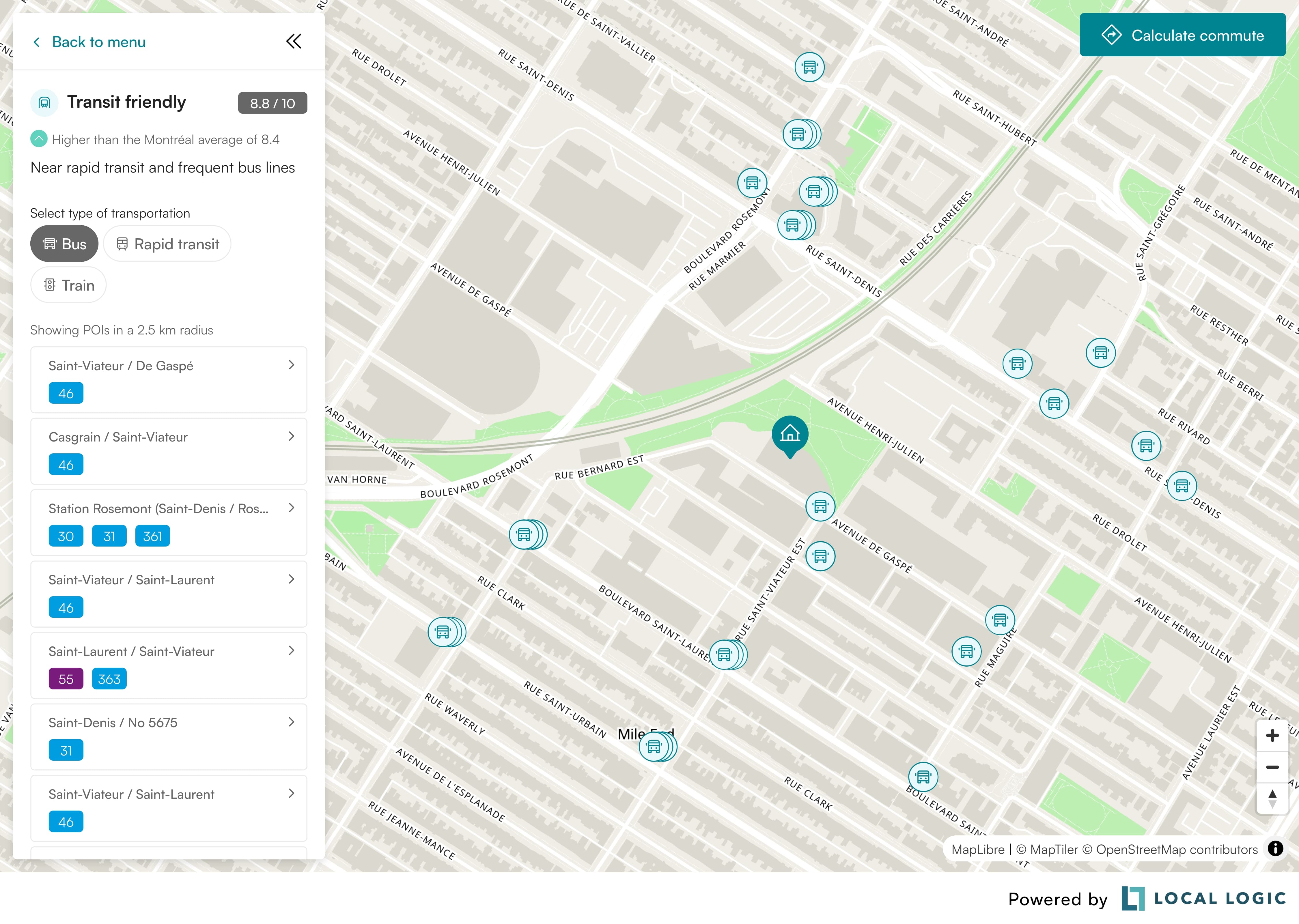
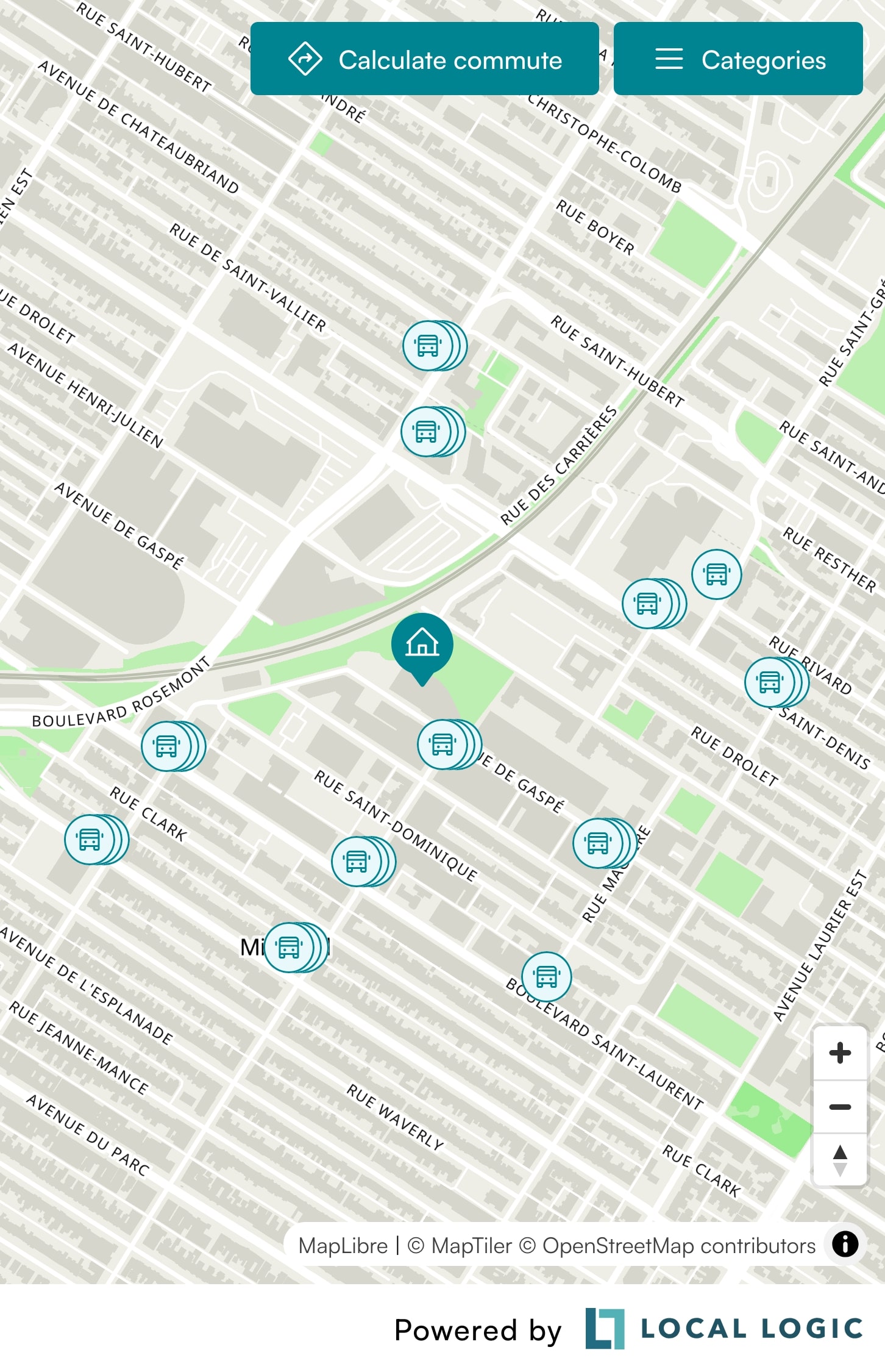
sdkOptions.marker | false | Marker | Will render a pin marker on the map representing the lat/lng. The marker can be used to symbolize a location being analyzed. If the marker is not provided, commute-related features will be hidden. | |
sdkOptions.zoom | false | number | 16 | Initial viewport zoom. The map will zoom in to the specified lat / lng after initializing as well as when loading markers on the map and calculating commute. This option only specified the "start" zoom of the map. |
sdkOptions.pitch | false | number | 0 | Initial viewport pitch. |
sdkOptions.bearing | false | number | 0 | Initial viewport bearing. |
sdkOptions.cooperativeGestures | false | boolean | true | If true, scroll zoom will require pressing the ctrl or ⌘ key while scrolling to zoom map, and touch pan will require using two fingers while panning to move the map. |
sdkOptions.distanceUnit | false | DistanceUnit | metric | Primarily used for the commute calculator. Will display the distance in mi/yd under the imperial system or km/m under the metric system. |
sdkOptions.mapProvider | false | MapProvider | { name: "maptiler" } | Desired map provider data; key is only required if name is set to "mapbox" or "google", or if you specify a custom theme. |
sdkOptions.hideScores | false | boolean | false | Specifies whether or not scores should be hidden globally. NOTE: If set to true, scores without POIs won't be displayed. |
sdkOptions.scoresMenu | false | ScoresMenu | Options for customizing the Sidebar (on Desktop) and Categories Toggle Menu (on Mobile). | |
sdkOptions.showSchoolRatings | false | boolean | false | When available, will render school ratings in the POI popup and as a tag in the POI sidebar. |
Update
sdkInstance.update(sdkOptions)
This function is used to update the widget with new values. This can be useful when, for example, you want to change the widget location.
The sdkOptions object follows the same structure as on creation.
On
sdkInstance.on(event, callback)
This function takes a callback which is triggered when an event occurs. Currently, there is only one event.
| Name | Required | Type | Default | Description |
|---|---|---|---|---|
event | true | "change" | The name of the event. | |
callback | true | CallbackFunction | The callback to be triggered when the specified event occurs. |
type CallbackFunction = ({ type: string, data: unknown }) => void;
Destroy
sdkInstance.destroy()
This function is used to teardown the created SDK widget.
Maps
The SDK currently supports 3 maps: MapTiler, Mapbox and Google Maps.
- MapTiler
- Mapbox
- Google Maps
MapTiler is used by default and the map api key belongs to Local Logic.
If you wish to use MapTiler with a custom theme, you will need to provide your own MapTiler API key when implementing the SDK.
Mapbox is supported as a map provider, but you will need to provide your own Mapbox API key when implementing the SDK.
If you wish to use Google Maps, you will need to supply your google api key when implementing the SDK.
Extra steps for enabling Google Maps support
-
Retrieve your Google Maps API key from your Google Cloud Platform project. If you do not have an API key, here are instructions on how to set one up.
-
Within your Google Cloud Platform project, please have the following APIs enabled for use:
- Maps JavaScript API
- Routes API
- Places API (New)
Not to be confused with Places API, which is the older version.
For instructions on how to enable Places API for example, see this link.
-
Add the
mapProviderparam within your SDK container configuration. The value for thenamekey should be set to"google". Your Google Maps API key should be provided underkey. Please see the following as an example configuration:
Example
const sdkOptions = {
// Set the lat and lng of the location
lat: 45.5282164,
lng: -73.5978527,

// ...Other sdk specific options

mapProvider: {
name: "google",
key: "your-api-key-here",
};

localLogicSDK.create("local-content", container, sdkOptions);
Type definitions
Marker type
// Typically the same as lat / lng provided in the main options
type Marker = {
  lat: number;
  lng: number;
};
DistanceUnit type
type DistanceUnit = "metric" | "imperial";
MapProvider type
type MapProvider = {
  name: "maptiler" | "mapbox" | "google";
  // Required when using Google Maps or Mapbox as well as when using MapTiler with a custom theme
  key?: string;
  // Map provider specific theme ID
  theme?: string;
};
theme format
- MapTiler
- Mapbox
- Google Maps
Format: Map UUID string
Used as: https://api.maptiler.com/maps/{theme}/style.json?key={apiKey}
The theme is the map ID from your MapTiler Cloud account. You can find it in the URL when viewing a map style in the MapTiler Cloud editor — it's the UUID segment after /maps/.
Default: 600d69cb-288d-445e-9839-3dfe4d76b31a
Format: {username}/{style_id}
Used as: mapbox://styles/{theme}
This is a Mapbox style URL without the mapbox://styles/ prefix. It combines your Mapbox username and the style ID, which you can find in Mapbox Studio under your style's share options.
Default: locallogic/cmb9nz9kb011501ru8drq8fqf
Format: Map ID hex string
Used as: passed directly as the mapId prop to the Google Maps component
This is a Google Maps Map ID, which you create in the Google Cloud Console under Maps Management. It enables cloud-based map styling.
Default: a7ff20eb973126bb
ScoresMenu type
Default values
const scoresMenu = {
  defaultOpen: true,
  title: true,
  categories: {
    amenities: {
      hide: false,
      order: 0,
      colors: {
        background: "#FFF2C3",
        fill: "#BF8500",
      },
      scores: {
        shopping: {
          hide: false,
          hideScore: false,
          order: 1,
        },
        groceries: {
          hide: false,
          hideScore: false,
          order: 2,
        },
        restaurants: {
          hide: false,
          hideScore: false,
          order: 3,
        },
        cafes: {
          hide: false,
          hideScore: false,
          order: 4,
        },
      },
    },
    education: {
      hide: false,
      order: 1,
      colors: {
        background: "#E4EFFF",
        fill: "#003548",
      },
      scores: {
        daycares: {
          hide: false,
          hideScore: false,
          order: 1,
        },
        primary_schools: {
          hide: false,
          hideScore: false,
          order: 2,
        },
        high_schools: {
          hide: false,
          hideScore: false,
          order: 3,
        },
      },
    },
    transport: {
      hide: false,
      order: 2,
      colors: {
        background: "#E9F8FA",
        fill: "#008491",
      },
      scores: {
        transit_friendly: {
          hide: false,
          hideScore: false,
          order: 0,
        },
        car_friendly: {
          hide: false,
          hideScore: false,
          order: 1,
        },
        pedestrian_friendly: {
          hide: false,
          hideScore: false,
          order: 2,
        },
        cycling_friendly: {
          hide: false,
          hideScore: false,
          order: 3,
        },
      },
    },
    character: {
      hide: false,
      order: 4,
      colors: {
        background: "#FFDAAC",
        fill: "#FF7044",
      },
      scores: {
        nightlife: {
          hide: false,
          hideScore: false,
          order: 1,
        },
        vibrant: {
          hide: false,
          hideScore: false,
          order: 2,
        },
        historic: {
          hide: false,
          hideScore: false,
          order: 3,
        },
        quiet: {
          hide: false,
          hideScore: false,
          order: 4,
        },
      },
    },
    nature: {
      hide: false,
      order: 5,
      colors: {
        background: "#D8F4D9",
        fill: "#0F766E",
      },
      scores: {
        parks: {
          hide: false,
          hideScore: false,
          order: 1,
        },
        greenery: {
          hide: false,
          hideScore: false,
          order: 2,
        },
      },
    },
    health: {
      hide: false,
      order: 6,
      colors: {
        background: "#FFE7FE",
        fill: "#FF84D6",
      },
      scores: {
        wellness: {
          hide: false,
          hideScore: false,
          order: 1,
        },
      },
    },
  },
};
// NOTE:
// You only need to provide the options you wish to override inside the scoresMenu.
// The SDK will use the default values for any options not provided.

type ScoresMenu = {
  // Indicates whether the Sidebar (on Desktop) should be open by default
  // Defaults to true
  defaultOpen?: boolean;

  // Title of the Sidebar (on Desktop)
  // If set to false, the title will not be displayed
  // If set to a string, the title will be displayed with the provided string
  // When supplying a string, the SDK will not translate the title
  // Defaults to "Categories" in English and "Catégories" in French
  title?: boolean | string;

  categories?: {
    [key in CategoryKey]?: CategoryOptions;
  };
};

// Represents the top level score groupings
export type CategoryKey =
  | "amenities"
  | "education"
  | "transport"
  | "character"
  | "nature"
  | "health";

type CategoryOptions = {
  // Indicates whether the category should be hidden
  // If set to true, all scores in this category will be hidden
  // Defaults to false
  hide?: boolean;

  // The order in which the category should be displayed
  // Lower numbers will be displayed first
  // If 2 categories have the same order, they will be displayed in the order they were defined
  order?: number;

  // Colors that all the scores and POIs in this category will use
  // If not provided, the SDK will use the default colors for the category
  // If provided, the colors will override the default colors for the category
  // Accepted values are hex and rgb colors
  colors?: {
    background: string;
    fill: string;
  };

  // Scores that will be displayed in this category
  scores?: {
    [key in ScoreKey]?: ScoreOptions;
  };
};

type ScoreOptions = {
  // Indicates whether the score should be hidden
  // If set to true, the score (and anything associated with it) will not be displayed
  // in the sidebar (on Desktop) or the categories toggle menu (on Mobile)
  // Defaults to false
  hide?: boolean;

  // Indicates whether the score value should be hidden
  // If set to true, the score value will not be displayed in the sidebar (on Desktop) or the categories toggle menu (on Mobile)
  // NOTE: If set to true, scores without POIs will not be displayed at all (acting as the hide option)
  // The scores without POIs are: Pedestrian friendly, Cycling friendly, Greenery, Quiet and Historic,
  // Defaults to false
  hideScore?: boolean;

  // The order in which the score should be displayed
  // Lower numbers will be displayed first
  // If 2 scores have the same order, they will be displayed in the order they were defined inside the object
  order?: number;
};